
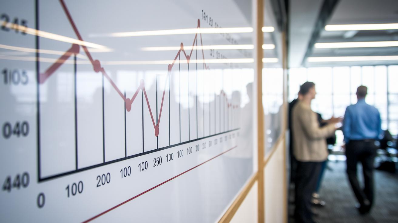
Ever noticed a sudden spike on a chart that feels like being stuck in bumper-to-bumper traffic? Tariff graphs take hard-to-read numbers and turn them into simple pictures that show changes in policy and trade over time. They shine a light on hidden trends and make differences clear. In this post, we'll show you how these graphs help both experts and students compare changes throughout the years, and even guess what might happen next. Every line and bar tells a story about the world of trade.
Tariff Graphs for Trend and Comparative Insights

Clear and well-labeled tariff graphs are essential for people working in policy and academia. They let experts quickly spot changes and trends hidden in a pile of data. For example, when you see a graph with a sudden spike in tariffs, kind of like noticing a traffic jam on a busy road, it immediately makes you wonder about changes in policy. These visuals help users see both long-term shifts and short-term ups and downs.
There are several common graph types used. Here are a few:
- A line chart that shows average import tariffs over the years.
- A bar chart that displays tariff revenue as a part of a country's GDP.
- An overlay chart that puts supply and demand curves together to highlight tariff changes.
- An area chart that makes the loss of consumer surplus and deadweight loss easy to see.
Each type has its own strength. The line chart keeps track of tariff changes over time in a simple way. The bar chart gives a clear look at how tariffs can affect national revenue. The overlay chart shows how markets adjust when new policies come into play. And the area chart makes it obvious how consumers might lose out when tariffs change.
Interactive features, like picking up extra details when you hover over data points and filters for different countries or years, make these graphs even easier to understand. They offer real-time details so users can make more informed economic decisions.
Charting Global Tariff Rates Over Time
Global tariff rates tell us the average taxes that countries put on imported goods. Trusted sources like the WTO and national customs agencies provide this information and keep a close eye on tariff details. These details are important signals for governments and market watchers who want to know when policies might be about to change. Think about it, analysts use this data to spot moments when trade rules are about to tighten or loosen, sparking big debates on international economic policy.
Between 2010 and 2023, there were clear moments when tariff rates shot up or dropped suddenly. Sometimes, a sharp rise lined up with heated trade disputes, while other times, tariffs fell when countries decided to ease trade restrictions. These ups and downs help explain major global trade events like tough negotiations and strategic economic shifts across nations.
When checking out these charts, start by focusing on the trend lines to see how tariff rates have shifted over time. Notice any recurring peaks or dips that might hint at seasonal patterns, and pay attention to any notes that mark policy changes. These little details connect the visuals to real-world events, making the charts powerful tools for understanding the impact of international trade tariffs.
Consumer and Producer Surplus Shifts in Tariff Graphs
Looking at surplus helps us see who wins and who loses when tariffs change market behavior. Experts check how consumer and producer surpluses shift to understand who ends up paying extra and who benefits from these policies. For instance, when tariffs push up import prices, consumers often pay a lot more, while local producers might enjoy increased earnings even if things become less efficient overall.
Consumer Surplus Diagram
When tariffs raise the price of imports, consumers lose part of the value they used to enjoy at lower prices. Imagine a chart where the area under the demand curve gets smaller with the new tariff, that shrinkage is the lost consumer surplus. After a tariff hike, consumers might feel like their full basket of options is suddenly only half full.
Deadweight Loss Illustration
Tariffs generally create two deadweight loss triangles on the graph. One triangle forms because some trades that would have happened without the tariff don't occur, and the other appears when production shifts less efficiently. These triangles mark losses in economic efficiency that benefit neither consumers nor producers. Look for these triangles on each side of the government revenue rectangle to really grasp the tariff's overall impact.
| Surplus Component | Graph Label | Description |
|---|---|---|
| Consumer Surplus Loss | A | Area under demand above post-tariff price |
| Producer Surplus Gain | B | Area above supply below post-tariff price |
| Government Revenue | C | Rectangle between old and new price over quantity |
| Deadweight Loss | D | Triangles on both sides of revenue rectangle |
Supply and Demand Curve Adjustments with Tariff Graphs
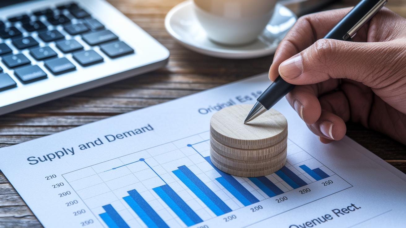
Imagine a graph that lays out the basic supply and demand for an imported good. The horizontal line shows the quantity available, while the vertical line tells you about price. In a situation without trade, the market finds its balance at a price of £1.80 with 40 million units sold. That’s where what producers are ready to send out meets what consumers are eager to buy.
Now, add a little twist with a per-unit tariff of £1. This extra cost nudges the supply curve upward by exactly that amount. The new, shifted line then meets the demand curve at a higher price on the chart, marking a fresh balance in the market. Picture the original line lifting up, sparking a new point where supply and demand meet.
With the tariff in place, the market now settles at a higher price but a lower quantity than the original 40 million. The chart even shows a neat rectangle between the old and new price levels that represents government revenue. As you look at the adjusted curves, you can see the clear effects: consumer surplus drops, producer surplus might see a slight boost, and some deadweight loss appears to signal areas of market inefficiency.
Import vs. Export Tariff Graph Comparison
When you check out an import tariff graph, you see the supply curve moving upward. This shift makes local prices climb a bit above the world market rate, like the cost of a balloon that slowly fills up until every extra unit reminds you of its rising price. At the same time, local producers benefit because their goods look more attractive, even if buyers end up paying more.
Now, if you flip the scene to an export tariff graph, things look a bit different. Here, the graph shows how domestic prices can drop compared to international ones, sometimes because the demand shifts downward or the supply adjusts differently. This means that while producers might earn a bit less, these tariffs can help make exported goods more affordable abroad.
Both types of graphs serve their own purposes. Import tariffs often help protect local markets and generate government funds, whereas export tariffs, which you don’t see as often, are used strategically to deal with foreign competition. Also, keep in mind that tariffs and quotas aren’t the same thing, quotas control the amounts of goods allowed rather than adding a per-unit cost.
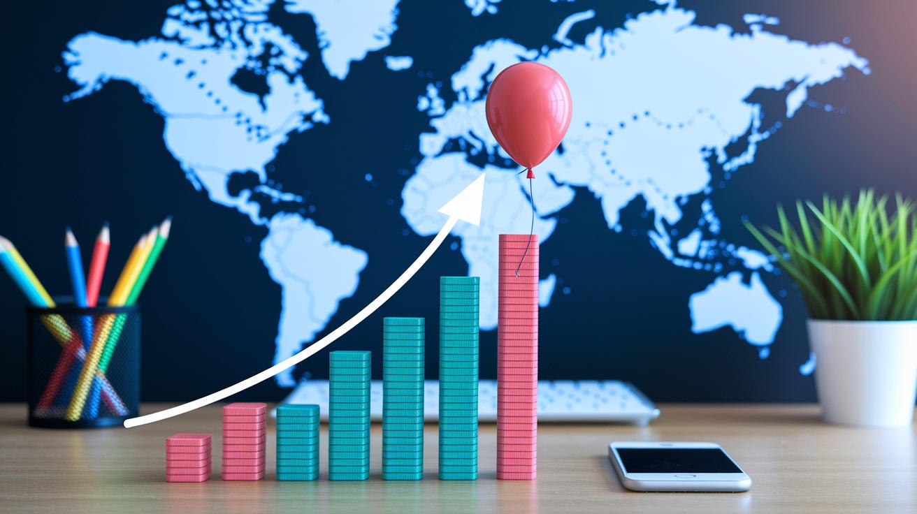
Forecasting Tariff Revenue Trends with Graph Models

Graph models help us predict how tariff revenue might change over time by using past data as a guide. Analysts often look at trends with a method called time-series regression, which checks old numbers to guess what might come next. They also use scenario modeling, where they build different possible paths for revenue based on what might happen with new policies. For example, a small change in tariffs might show a shift in revenue if you look at historical data. And by exploring different scenarios, we get a clear idea of what might occur if tariffs go up or down.
A typical scenario-comparison chart uses several lines to show low, medium, and high tariff outlooks. Think of it as comparing different stories about the future. A low tariff path might mean steady and gradual revenue growth, while a high tariff path could show quick, big changes. Important policy events are marked along these lines, like a note pointing out a potential tariff conflict in 2025 with a special levy per item. These notes remind us of past or expected moves and help give context to the revenue forecasts. With these lines, decision-makers can easily see and compare different possible outcomes.
When you study these projection graphs, pay attention to where the lines move apart. When they spread out at key moments, it signals a time to really think about the financial impact. Watching these gaps helps policymakers figure out the likely effects on revenue versus how the market might react. This way, they can build strategies based on solid data and make sure any future tariff changes fit well with broader economic goals.
Final Words
In the action, you explored how clear tariff graph visuals can simplify complex trade data. We looked at line charts, bar charts, overlay views, and area charts that show import trends, revenue shares, and shifts in consumer and producer surplus. The post explained how interactive features help you read graphs and compare market changes. These visual tools bring real insights to tariff graph analysis, helping you make smarter investment decisions and build a more solid financial future. Stay positive knowing the power of data is at your fingertips.
FAQ
Q: What does a tariff graph illustrate in economics?
A: The tariff graph shows how changes in tax rates affect trade, displaying trends in import costs, revenue collection, and shifts in consumer and producer benefits. It helps policy experts and scholars assess trade impacts.
Q: How do import tariff graphs serve economic analysis?
A: The import tariff graphs reveal shifts in tax rates on imported goods. They turn complex data into clear trends, helping users understand how trade costs and market conditions adjust over time.
Q: What insights can be drawn from tariff graphs under Trump’s administration?
A: Tariff graphs from Trump’s period highlight noticeable shifts in imposed taxes. They display how policy changes altered trade dynamics and cost structures, offering a clear picture of that era’s economic measures.
Q: Are Trump’s tariffs still in effect?
A: Many of Trump’s tariffs remain active, continuing to influence trade dynamics and pricing. Updates from new policies and market shifts have adjusted but not fully removed these measures.
Q: What role did Trump’s tariffs play in inflation?
A: Trump’s tariffs added costs to imports, which could raise consumer prices and contribute to inflation. Various factors work together, so tariffs are part of a broader set of influences on price levels.
Q: What is the U.S. average tariff rate on China and how is it represented?
A: The U.S. average tariff rate on China is shown as a percentage that fluctuates over time. Graphs tracking these rates help explain changes in trade policy and pricing strategies between the two nations.
Q: How can tariff revenue be calculated from a graph?
A: The calculation takes the tariff rate multiplied by the volume of imports. A graph showing these data points lets you estimate revenue by comparing changes in tax rates and import quantities.
Q: What is a quota diagram and how does it differ from tariff graphs?
A: A quota diagram displays limits on the allowed quantity of goods, while tariff graphs outline tax rate changes. They address trade policy from different angles—one restricts volume; the other affects pricing and revenue.
Q: Where can I find lists of U.S.-China tariffs and recent tariff details?
A: Detailed lists and PDFs of U.S.-China tariffs are typically provided by government agencies and trade research institutions. They offer product-specific rates and updated information for policy and market study.
Q: What are the four types of tariffs?
A: The four types include specific tariffs (fixed fee per unit), ad valorem tariffs (a percentage of value), compound tariffs (combining both methods), and variable tariffs (rates that adjust over time).